


/identity /packaging
Bahlsen Global Relaunch
Bahlsen asked us for a revolution, a vision of the brand ten years on and, most of all, to help them become an icon through the restyling of the whole product portfolio.
CLIENT
The German family enterprise Bahlsen is an international sweet biscuit manufacturer. In Germany Bahlsen is the most successful manufacturer in this market and with the brands BAHLSEN and LEIBNIZ market leader. Also throughout Europe, Bahlsen is one of the most successful sweet biscuit companies since 1889.
ASSIGNMENT
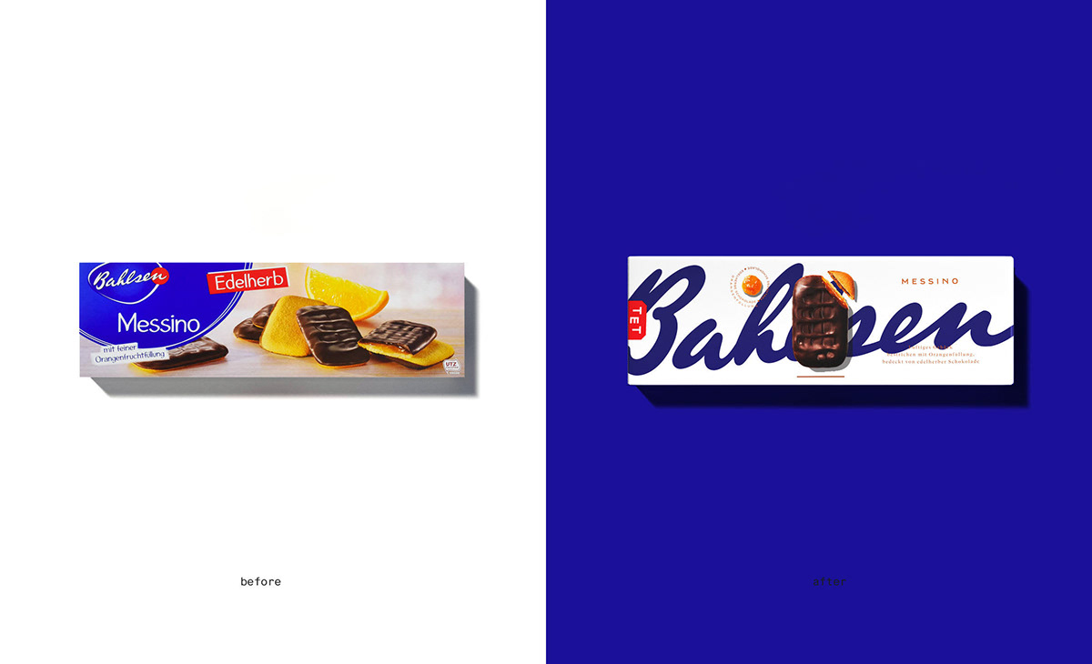
With a bold and innovative legacy from the past, the Brand realized that the current identity and packaging didn’t move with the time anymore having lost a defined personality. They asked us for a revolution, a vision of the Brand 10 years forward but, most of all, they wanted to become an icon.
SOLUTION
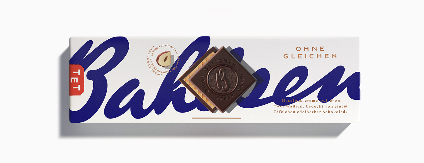
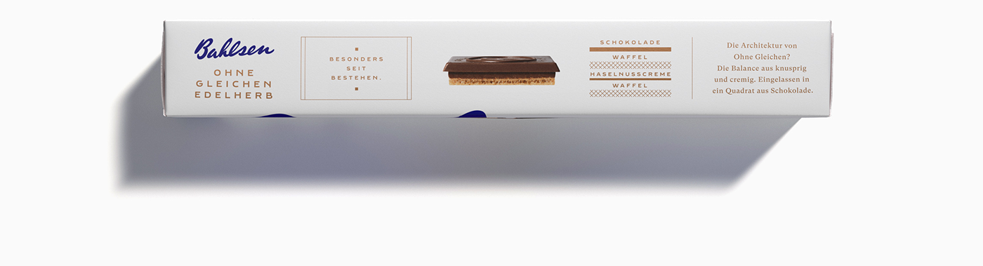
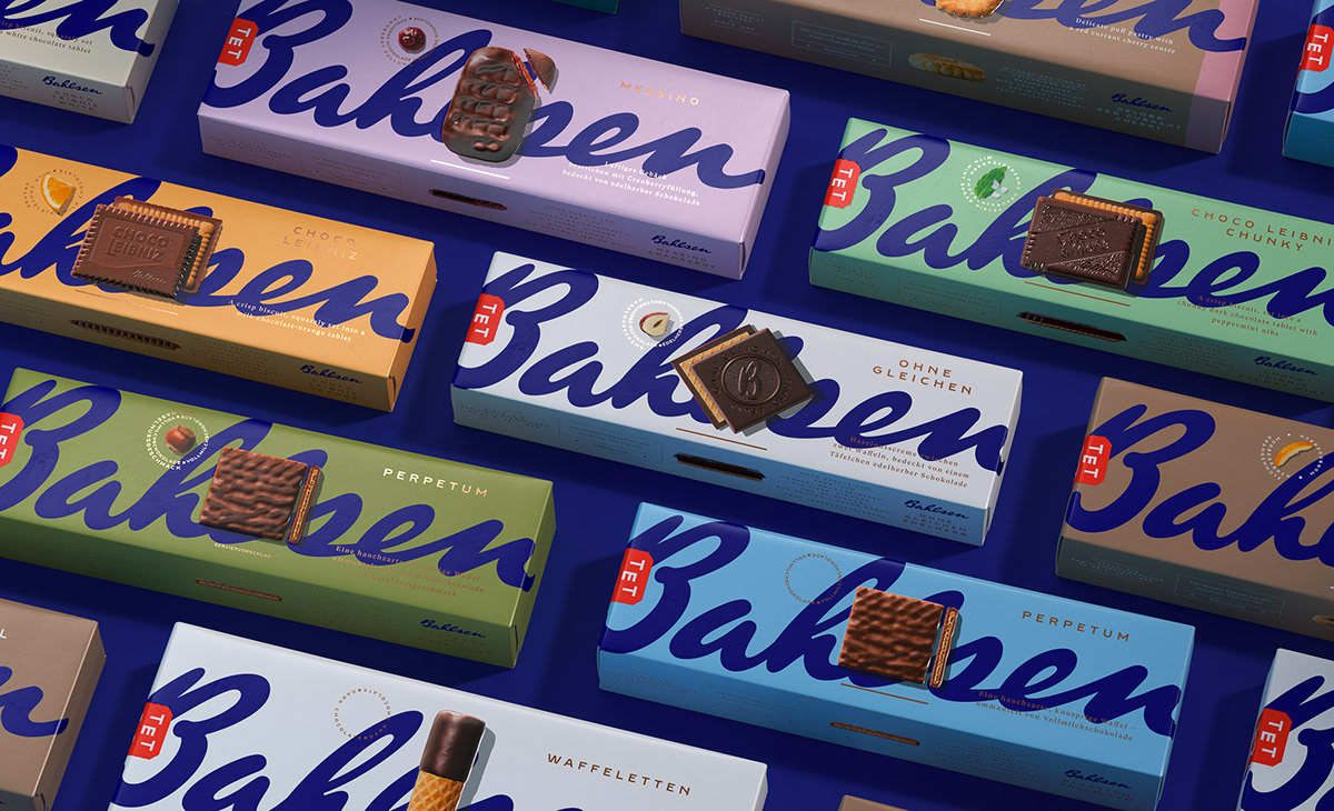
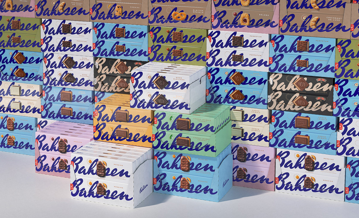
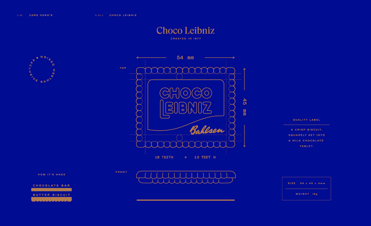
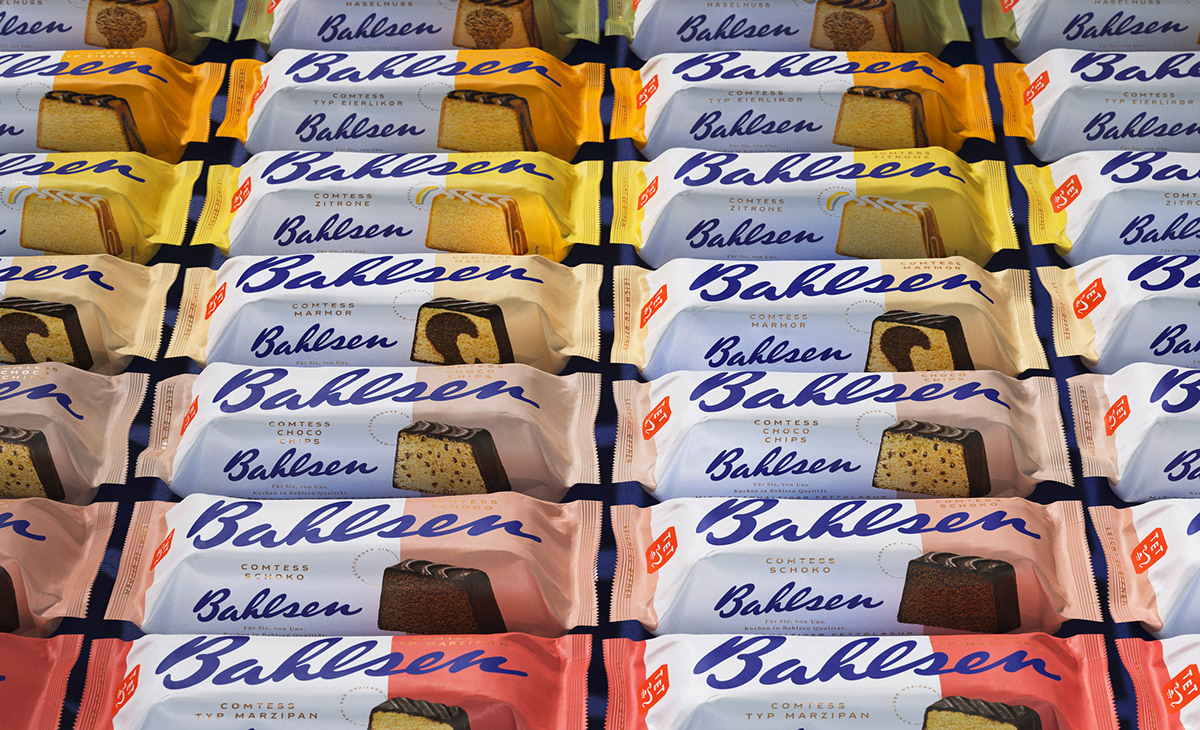
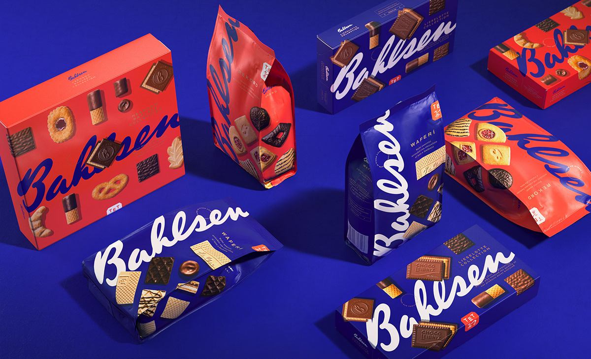
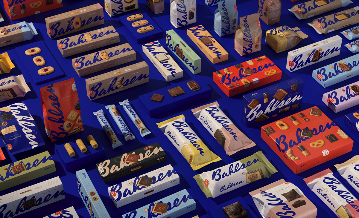
To be an Icon means to become immediately recognizable, strong and distinctive, something not possible to copy, instead an example of boldness. We decided to emphasized the most crucial element, the blue signature, exploding it on the packaging and to combine it with a multicolor background system that changes with the flavors. Besides the photography of the products had to be iconic as much as the signature, the Bahlsen biscuits are like pieces of Art, the result of a detailed work of craftsmanship.
PROCESS
We had to build a complex architecture made of more than 80 products divided in 4 different ranges by keeping coherency regarding the usage of the signature and the Photography but at the same time conferring to each range a specific style and personality.
---
Executive Creative Director: Davide Mosconi
Strategy Director: Federica Ariagno
Design Director: Miriam Frescura
Project Manager: Martina Delfini
Photography: Food Pirate Studio
3d Artist: Williams Tattoli
---
YEAR / 2021


Thank you.


